“JibberJobber is like a beautiful woman in an ugly dress.” – some investor, a few years ago.
When JibberJobber launched, 10 years ago, the world was different. Users were different. They kind of took what they could. Over the years I got comments like “I don’t trust JibberJobber with my credit card because the site looks old.”
So, we started the hunt for someone who could help us with our design. Back then I was looking for someone who specialized in UI, or “user interface.” This should mean many things, but in my mind, today, it just means look and feel.
In 2012 we invested in a UI guy, and he made huge improvements (see images below). I was pretty happy with him, although I had a few reservations on color and some design stuff. But overall, it was a great change, and we were moving in the right direction.
The day after we released his new design, I got an email from someone saying “your site looks too outdated.” What?? One day after all of our UI changes, I still got complaints?
Ugh.
I realized this is something I could not win. Meanwhile, I had some new competitors (over the last 10 years there have been about 20 competitors, most of them are gone now) who launched with BEAUTIFUL design. Seriously beautiful. But, (a) their users came over to JibberJobber because, even though we weren’t as beautiful, we had functional breadth and depth, and some of those sites were only beautiful, but not functional enough (hey, when you are doing personal CRM, you really need functional!), and (b) yeah, those sites didn’t all last. What can I say. I’ll be the tortoise to their hare.
I knew that instead of focusing my limited resources on trying to hit this moving target of “make it prettier,” I needed to continue to focus on functionality. JibberJobber has A LOT of functionality… stuff we’ve been developing over a 10 year period.
However, there was still an issue… and that is that people would sign up, get confused, and delete their account out of frustration. This was not a UI issue, it was what we call a UX issue. UX stands for “user experience.” Instead of focusing on colors and curves and aesthetics, we needed to answer this question:
How can we help the person who signs up figure out what to do next?
Instead of logging in and then staring at the screen in utter frustration, how could we help them know what next steps they could or should do?
That is more about the user EXPERIENCE (hence, UX). And for that, I finally, after 10 years, found the right person to help me put this together. His name is Udie Chima, and he has been awesome. In our conversations, he focuses on what our objectives are (which include getting more signups, and helping those signups become “users,” and eventually enticing users to actually upgrade). Instead of focusing on a color or a curve, he focuses on THE EXPERIENCE.
All this to say, we have changes coming. You might have already noticed one of them. Let me run through the history a bit, just for fun.
VERSION 2 (I don’t know if I have images of Version 1)
When we first launched, two people had “designed” JibberJobber. My first programmer, still with JibberJobber, and me. Neither of us are designers. We are good at functional, but not aesthetic. Hence, we got a lot of comments like “it looks like this was designed by programmers.” Because, well, it was. Here’s what JibberJobber used to look like, about 10 years ago:
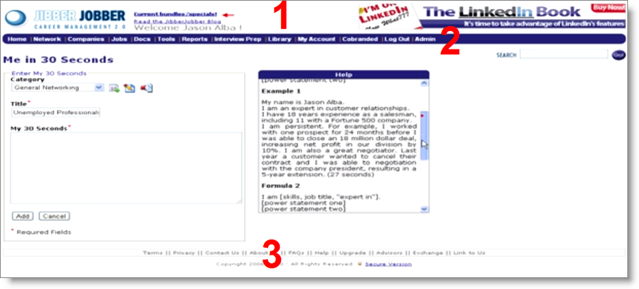
Notice the top (1) has an ad for my LinkedIn book. The menu (2) is dark blue/purple, and rounded corners… and the footer (3) is, well, as important as a footer should be. Not bad for 2006, I guess. Again, the focus was on functionality.
Version 3
This was “the new dress.”
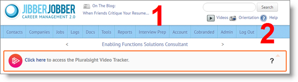
This is a cleaner look… moving the search box from the right side to the top-right… and less “heavy.” Good changes, which we’ve had for a while.
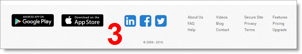
This footer is cleaner, and emphasizes things because they are in three columns… I LOVE the app icons (because they are relatively new). The left is the policy and help stuff… the middle is social and other (mobile), and the right is upgrade and contact us and content value-add.
Version 4
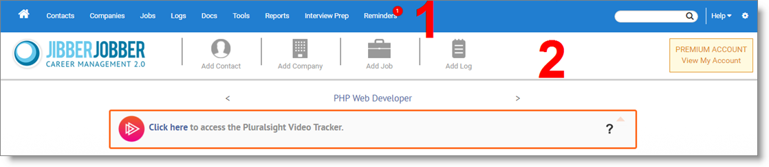
This is Udie’s design. There are many things going on here… but most visibly, we are shifting the menu to the very top, like LinkedIn, Facebook, Twitter, WordPress, and many other sites do. This is just “how it’s done” now, and it’s clean and easy, and people expect it. The top, in blue, is the top level menu. Much of it is the same as what we have had, but we cleaned some stuff up. Notably, we added a home icon (before you had to figure out to click the icon)… notice, also, the help link on the right, and the settings icon on the far right.
The second level menu has the most important “calls to action” for new users. Instead of “what do I do now,” I would expect them to see that here, in JibberJobber, you can (drum roll) add a Contact, add a Company, add a Job, and add a Log Entry. This is really the core of the value to JibberJobber users, so why not show them how to do these tasks easily? And, because we are not allergic to money, or paying our bills, we want the idea of upgrading to be a little more obvious… The invitation to upgrade, and unlock the very cool premium features, was somewhat hidden in the past. No longer…. we’re happy to finance JibberJobber through making users happy 🙂
This second level menu is the difference between UI (“oooh, pretty!”) and UX (“oh, now I know what to do!!”).
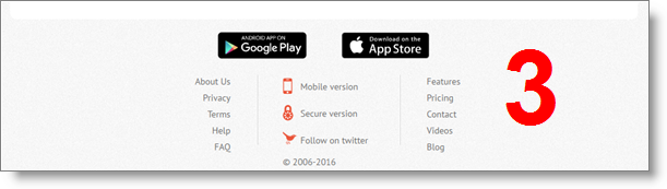
This footer is still vertically compact. and what were the three columns are now broken down and easier to see. The four columns on the right are even strategically grouped.
So… there you go, we changed THE DRESS again. More to come!
Great work, Jason
This is good news that you’re addressing the usability of your site. The difficulty using it has always stopped me from doing anything with my account.
When mentioning Jibber Jobber to others, I’d warn them it is like interacting with a Microsoft Sharepoint site (that’s not a compliment) and “if you really can’t figure out how to keep track of your job search then you might find it worth the effort to try to figure out how to use it.”
@Norm thanks 🙂
@Me: thanks for the comment. It’s interesting that i hear some people say it’s totally intuitive and easy to figure out, and others who have no idea where to start. UX has always been an issue, but it hasn’t been until recently that we have finally gotten professional help. As I mentioned, I’ve been searching for a real UX person who could really help me for 10 years now. I figure this will be a multi-year process.
Your efforts are and WERE noticed, as we are in JibberJobber daily! It is interesting that some people say it’s totally intuitive and easy and others have no idea… PERCEPTIONS!!! As we teach at JaneCo, people have their preferences on approaching tasks and details and their different learning styles. You are appreciated for all you do and your never-ending willingness to help everyone, no matter their style preferences! I’m a Jason fan.
Really like the new look – great work Jason and Udie.
Now its a beautiful woman in an elegant dress 🙂
Thanks @Jane and @Adrian!