The book is getting close to going to the printer. I am sending a draft to “the person” who will write the forword, and my graphics artist shot me three book cover ideas.
I would love your feedback on these three covers. Will you please tell me which of the three you love, which you love the least, and WHY? Thank you!
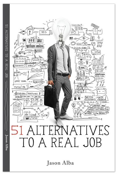
Idea A: Lightbulb Head
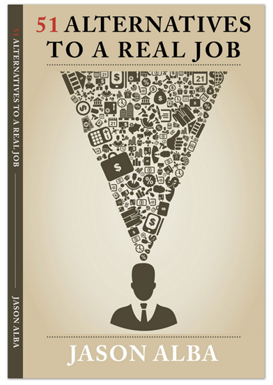
Idea B: Triangle Head
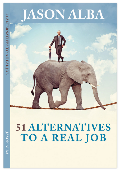
Idea C: Elephant on Tightrope
Please leave a comment of email me (Jason@JibberJobber.com) what you think. Again, I’d love to know your favorite, least favorite, and WHY.
Dear Jason
The Second one work because of the expansiveness of thought, If you brought the elephant into the room , then how much space do you require? Good luck wih the Book
Hi, I love the first one and dislike the third one. Why? The first one is original and catches your eye. I am sure I have seen the third one used before or at least a version of it. Good luck with your book!
The first one – Edison with the bulb – DaVinci with the sketches, contemporary person – nice mix on genius ideas.
I like the first one. It has a feeling of optimism and excitement about figuring out a plan. The second creeps me out somehow. The third just doesn’t seem to connect with the title, or implies that the ideas in the book are kinda impractical.
Hi Jason,
The first one is great, original, playful and young looking that works for years.
However, you may want to ask the artist to adjust the spacing, do you feel the title is a bit too near the man? His shoes is literally stepped on the letter “N”.
Great Work!
A – is much more on brand for you, your style and the way you post, think, speak. My point of view.
Lately there has been increasing conversation about women in the workplace and not getting ahead. With that is mind, all of the covers appear to be for “men only”. I hate to be the critical one, but more interest may be generated, if you had a byline as to what the book is trying to address.
I prefer the first cover because it depicts a young, millennial-type, who as a group are probably the most open to alternatives to “real jobs”. I least prefer the second because its not clear to me how the graphic relates to the title.
Good luck!
Jason, great idea to get feedback.
I like #1 best — most original and distinct. Only suggestion
I would have is to put more white space around the male
image so he has some room to breathe and so his image doesn’t bump up against the idea images. Will be fun to see which one you choose.
Best,
Billie
I love the last cover. The fellow looks well balanced!
I prefer the 3rd by a wide margin. I believe it is more eye-catching and professional-looking versus the first two which are cartoon-like. The first two look like something which an author has self-published.
I have to weigh in again based on jrogala’s comment above, and that is to agree that the male images are a bit off-putting. One suggestion might be to have an androgynous figure/image that doesn’t conjure gender stereotypes or issues. All the free advice from readers is priceless; use it to tailor your target audience & incorporate into the book. Just be sure to use consistent titles (your examples, is it “new” or “real” job??)
Jason,
To tell you the truth, none of these three covers impressed me.
I liked no. 1 because it transmits the idea of a book about getting a job, but it does not transmit the impression of being a serious book, rather humorous.
The worst is no. 2, the image says nothing about getting jobs. No. 3 is so-so, strong image, still does not illustrate the contents.
Frankly, I would send your cover artist back to the drawing board.
Before I pick one, I would say none of them really speak to the title – alternatives.
The one with the light bulb connotes something about an idea. Undoubtedly your book is filled with great idea, but your book is “51 Ideas for an alternative career”. Is the artwork really showing anything consistent with “alternatives jobs?” It’s also incredibly busy.
The Triangle Head looks like either stuff is exploding from the guys head or is being funneled into his head. Again, I’m not seeing anything that ties in with your title. The only thing that pops out in the triangle are dollar signs, nothing about careers.
The Elephant certainly connotes balance, but why an elephant? And is your book about balance? Maybe a good title for “Finding balance in your career and life”. The cover itself is clean, not busy and more inviting to look at.
If you can, how about something that focus on “alternatives”. maybe someone looking in a mirror and seeing a slightly different image (businessman on one side then the obviously same guy wearing a clown hat in the mirror). Essentially conveying an alternate universe where you have one of these 51 alternative jobs.
#1
The Lightbulb Man has the appeal of six people having dinner and one who is graphic designer and artist on the faculty of johns Hopkins U says #1 doesn’t promise anything but options as opposed to #3 which is somewhat confusing as to its promise to be crushed by an elephant. Also the shrink in the group feels #1 is the most optimistic over number 2 which has similar promise but is dark in nature based upon color selection.
The bulb and the sketches are orthodox. Still, the first one is better than the other two.
If you want to extend this idea, for today’s context,
you can replace the incandescent bulb with compact fluorescent bulbs which is an “alternate” to incandescent bulb. The sketches can be replaced with a contemporary concept e.g. “mind mapping-cloud based”.
I like the second cover because the implication is that there is a lot of experience and knowledge funneled into the innovative mind.
I dislike the last – elephant on a tightrope? Doesn’t seem to get the innovation point across,
I prefer the Lightbulb head, as it captures the “open ended” & less structured nature of entrepreneurialism.
I agree with Dan’s comment above – that the “whiteboard” format will resonate well with the younger demographic. I’ve seen it used to good effect by entities like RSA (see their excellent youtube videos).
The Triangle Head appears to speak to the challenge of managing all these options & information, but it implies more structure than I believe exists (or should exist) in this thesis. I would imagine this one (or the elephant on the tightrope) to resonate more with the older demographics.
One suggestion – it may be productive to tweak the 1st to make it a bit less busy and imply some form of progression from ideas to realization.
Best is 2.
1 is so busy the title gets lost.
3 does nothing for me.
#2 gets my vote. I see a huge amount of information out there, all organized and funneled neatly into my brain. I would like a bit more color or brightness in it, though.
I find #1 a bit stressful – the “noise” surrounding lightbulb head feels overwhelming.
#3, the elephant on a tightrope is visually appealing, but I don’t think it’s as effective as the others. I also wonder why the man has an umbrella, and I’m almost waiting for a “Mary Poppins” effect with him jumping off and floating down!
Hey Jason,
All are good – I prefer the elephant – the blue sky gives it an optimistic feel – it would encourage me to pick it up if it was on a book stand. I agree with an earlier comment about it looking more professional, but I still like the first two also.
Adrian K
I love the first one. It looks complicated yet is also very simple in a self-explanatory way. it looks modern, elegant, with serious material/ thoughts rather than just shallow words.
that’s my first impression. hope it helps.
Liked the first one best–it’s original and eye-catching (though I think I prefer the background color on the second). I like the elephant (third) option least, as it says nothing to me about what the content of the book may contain, thus coming across as a useless graphic.
Number one brings over the message best. Within the sketches you could bring in the symbols of version two, an acrobat on a rope-dancing elephant, a dolphin polisher, a star picker or whatever you are talking about in your book.
I wouldn’t mind seeing alternatives to the light bulb head. Maybe it’s an elephant’s head, who is juggling light bulb’s with his trunk? Try to come up with something remarkable.
As a publisher digital producer of some 20 years plus
N0 3 is best, number 1 is not bad.
Ask you distributor if you want an informed opinion.
Paul
I prefer Lightbulb Head – it shows a person who is always charged full of ideas
As many others I like the first one better. It’s original and it makes me want to read the book. Also because it looks like a book I can learn something from. The third one is my least favorite because it makes me think of a self-help book.
Hello,
The second one is the best for me. It is the clearest, I think, in demonstrating your proposition.
The first graphic is busy and looks sloppy and was my least favorite. My visceral reaction was I found it hard to look at.
The elephant graphic seems unrelated to what you are trying to say.
Cheers,
Jason
Congrats! The “issue” regarding the cover is totally irrelevant since the point is to take people to the links. And that is fine and seems to have worked.
I like the first one. Sensitive to the fact many females in the job market as well.
Interesting exercise as a promotion of your new book. Interesting array of responses as it certainly gives you a good idea if how different people are and that you can’t please everyone!
I think #1 is just ok, but visually cluttered and a bit dated graphically. Also just too literal, which I guess is ok for the segment of the population that don’t get symbols or metaphors. The Millennial guy is appealing if that is your target audience.
#2 is awful. Really dated graphics and colour scheme and symbolism. Yuck.
#3 is the winner, for all the reasons those above have said: visually appealing, optimistic, fun and amusing, the symbols work for me, and clearly it can mean many things to many people even though it means nothing to some. At least it gets attention. Man conquers beast, yeah, ok. Balance. Risk-taking. Innovation. All of those. But no one else seems to think it funny that “running away to join the circus” has always been a symbol for escape from the grind of conformity for those that don’t fit in. I LOVE that. Notwithstanding the above comments, flip the trunk up, nix the umbrella, and make your character less stuffy British dude and more contemporary (like guy in #1), but keep the confident and playful attitude. And you really have to think deeply about the gender issue. That is annoying. Not sure how to address it tho because research shows women can see past gender stereotyping but men are incapable of it so you might be safest as is.
#1 caught my eye… looks like my note pads… from getting up in the middle of the night… to preparing for interviews… to doodles while talking on the phone… easy to relate… enticing to open up and find out more
The second one, Jason, but fill in the guy’s features and lighten them so he’s smiling, perhaps, so he doesn’t look like a blockhead. This shows the ideas spouting from his head, and gives him credit for the idea that there are multiple ways to skin a cat. In the first one he looks too casual, and in the third one he seems a little smug.
I looked at all three more than once and kept coming back to #1. #2 was out immediately… it just did nothing for me. Liked #3 – really catchy visual but could not make the connection. #1 has that mind map thing going on – and I like it!
I really like the first one. Clever and intriguing to look at. Totally dislike the third. Doesn’t say anything to me.
I liked #3 the best after looking at them several times. Its visually very sharp and looks like someone who is positive and on his game.
Good Luck with a cover and also with book sales.
I really like idea C, elephant on a tightrope. I am one of the ghost writers you contacted for some material concerning ghost writing, by the way.
Jason,
The 1st or 3rd. Two different approaches. The first shows – what many people are doing – figuring out the next step. The third is aspirational, it leaves a good feeling and states the question. The second looks like tension without an answer.
I just love how everyone sees the same thing, yet everyone sees something different! This is so interesting to follow!
The 1st cover is pretty cluttered. While I am not sure what is represented by the elephant on a tightrope. So I would say that the 2nd cover is the one that catches your attention, but I think it needs more color than is presented in this version.
Good luck with your book.
I like option A and B. If i have to choose i would say A. I don’t like C. It looks like ‘i know it all’ and if i saw it on a bookshop, i wouldn’t bay it.