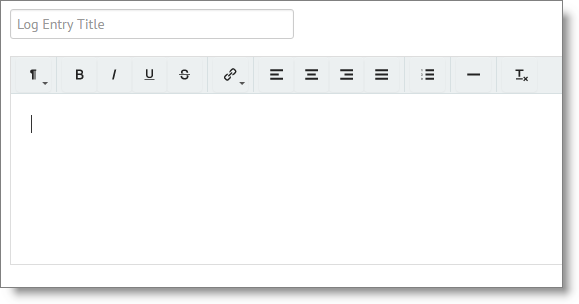
No, that’s not a typo… on the Log Entry page, we have a new entry form field. The goals where, in this order:
- Faster. The older form was…. older. It was bigger (in file size) than it needed to be, and technology has advanced to a point where we were able to find an entry form that was, I think, about 75% smaller than the old one. 75% means it loads a lot faster. Faster was easily 80% of the main reason for updating this.
- Less confusing. The old form had two rows of icons, many of which went largely unused, and enough of them were “what??? I have no idea what that does.” The new widget has only one row, and the icons are the most-used, and you shouldn’t have the “what does that do?” question as much.
- Cleaner look. It’s just a lot cleaner… the colors, the icons, the quantity… it’s beautiful. Not hard to improve on the old one, but it’s a nice look.
#2 and #3 are great… but the main, pressing objective was speed.
And this new solution hits on all three. Faster, less confusing, and cleaner!
The opposite of those are slower, confusing, and messy. You know what that means? A user experience with friction. like I mentioned yesterday, when talking about the calendar update, the goal is to reduce friction. We are on a hunt for friction in your experience. Are you on a hunt for friction in your job search? More on that tomorrow!
We’ll put this new form in multiple places in JibberJobber, and will roll those out over the next few weeks. Expect more cleanup from us… cleanup that will make a difference for you, and your experience with JibberJobber!