In our continuing quest to improve JibberJobber we decided to tackle something that might not seem like a big deal, but it was having a negative impact on our first impression and our brand.
I think we lost potential users because of this.
Let you think this isn’t a big deal, and we shouldn’t spend time on it, think about the idea of losing an interview opportunity just because your resume has a typeo… how stupid is that?
Stupid, yes, but it’s real. Someone sees a mistake on your resume and they think: sloppy, no attention to detail, if they don’t care about their resume, what will they care about??
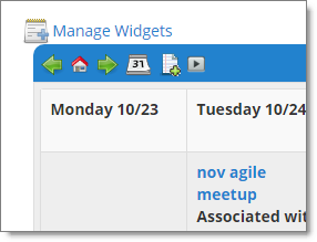
So, we cleaned up some things… on the homepage you have widgets so when you first login you can do or see what you want. We changed all the icons on the widgets from this:
To this:
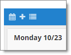
and this:
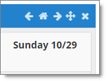
The icons and colors are more in-line with the rest of the site… at least they aren’t distracting or confusing.
What’s more, we changed the “tooltips,” which is the little bit of text you can read when you mouse over the icons. For example, the “x” on the far right of every widget used to say “delete.” Well, that was kind of true, it would, um… well… no, that wasn’t true. You wouldn’t delete anything. So we changed the tooltip to “Hide this widget from the homepage”. That is way, way more text, which seems to be a no-no online. But, it is accurate and descriptive.
Every icon and tooltip got a makeover… all in the effort to help YOU understand what each one does.
Minor stuff, but just like one typo on a resume, this should help us keep users happy.
There’s more, big and small, to come!