When I work with my Product Manager, Liz, and the developers, my consistent theme is to have JibberJobber load faster and to have the UX be more intuitive. This might seem like an easy task, but it’s really a combination of a thousand easy tasks… which is why we can’t just get this initiative done all at once.
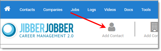
Nonetheless, we continue to move in that direction. An example is the new interface you get when you click on a link to add a new Contact, Company, or Job. There are various places that you can do this from… in this example, if you click Add Contact from the big icon on the main menu:
Instead of immediately going to the Add Contact page you will see this interface, with the four most commonly added data points for a new Contact:
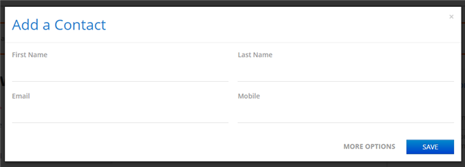
You can add any of the four data points (First Name is required, as usual), and then it quickly saves and doesn’t change the page you were on (which is great!), or you can click on More Options and you can go to the big Add/Edit page.
This makes the user experience much faster, and more intuitive (because you are now asked for four fields instead of over 20), and the code is a lot smaller so it’s faster to execute.
Expect to see more of this simplification and cleaning and speed improvement!